
Experiment 1.1.2
This is the second attempt at experiment 1.1. Same setup, more data collected.The setup is the same as 1.1.1, so it will not be repeated here. The dataset is stored in a slightly different format than before—flat rather than nested.
import numpy as np
import pandas as pd
import matplotlib as mpl
import matplotlib.pyplot as plt
import colorsys
presentation_mode = True
if presentation_mode:
    import warnings
    warnings.filterwarnings('ignore')
    plt.style.use('science')
    mpl.rcParams.update({'font.size': 20})
    mpl.rcParams.update({'axes.labelsize': 20})
    mpl.rcParams.update({'text.usetex': False})
1. Data
The format of the data is as follows.
The background was always monochromatic, so there is redundancy in the 3 RGB values for the background color. We will reduce them to 1, and call the column simply bg.
data = pd.read_csv('./resources/experiment_1_1_2.csv')
data = data[['ans', 'circle_r', 'circle_g', 'circle_b', 'bg_r']].rename(columns={'bg_r':'bg'})
data
| ans | circle_r | circle_g | circle_b | bg | |
|---|---|---|---|---|---|
| 0 | 1 | 0.256328 | 0.138022 | 0.003227 | 0.842528 |
| 1 | 0 | 0.220064 | 0.104095 | 0.049352 | 0.179817 |
| 2 | 0 | 0.909456 | 0.460141 | 0.017742 | 0.185529 |
| 3 | 3 | 0.982861 | 0.923622 | 0.719634 | 0.667206 |
| 4 | 3 | 0.844324 | 0.850299 | 0.696988 | 0.624025 |
| ... | ... | ... | ... | ... | ... |
| 1298 | 0 | 0.540997 | 0.307284 | 0.127805 | 0.336290 |
| 1299 | 3 | 0.691200 | 0.675850 | 0.125323 | 0.362580 |
| 1300 | 1 | 0.179906 | 0.144833 | 0.075628 | 0.084772 |
| 1301 | 3 | 0.096047 | 0.074515 | 0.046541 | 0.669724 |
| 1302 | 3 | 0.480772 | 0.487775 | 0.284502 | 0.887272 |
1303 rows × 5 columns
Circle and background color generation function
A change was made to the color generation function used in the previous attempt.
After a color was generated, with the same procedure as before, a check was done to skip color pairs that we are very confident are going to be neither orange nor brown. This decision was done by training a logistic regression classifier such that it had 100% recall on the data from the previous attempt. This was done to reduce the number of “neither” data points, where were very numerous in the previous attempt.
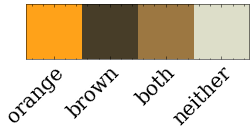
Figure colors
The below figures will use a color scheme created in this section.
orange_marker_color = '#ffa219'
brown_marker_color = '#473d28'
both_marker_color = '#9c7741'
neither_marker_color = '#dddec9'
# orange, brown, both, neither
plot_colors = [orange_marker_color, brown_marker_color, both_marker_color, neither_marker_color]
color_list = [plot_colors[i] for i in data.loc[:,'ans']]

colors_as_vec = [mpl.colors.to_rgb(c) for c in plot_colors ]
fig, ax = plt.subplots(figsize=(4, 12))
img = ax.imshow(np.array([colors_as_vec]))
ax.set_xticklabels(['orange', 'brown', 'both', 'neither'])
plt.xticks(np.arange(0, 4, 1.0))
ax.get_yaxis().set_visible(False)
plt.setp(ax.get_xticklabels(), rotation=45, ha="right", rotation_mode="anchor");
#ax.set_title("Figure color map");
#### Figure 1: RGB scatter plots, colored by answer
def scatter_matrix_plot(data_):
    plot_data = data_.rename(columns={'bg':'Background R,G & B',
                                     'circle_r': 'Circle R',
                                     'circle_g': 'Circle G',
                                     'circle_b': 'Circle B'})
    ax1 = pd.plotting.scatter_matrix(plot_data.loc[:, data.columns != 'ans'],
                              c=color_list,
                              figsize=[20,20],
                              diagonal=None,
                              alpha=0.7,
                              s=200,
                              marker='*')
    ax1[0,0].yaxis.set_major_formatter(mpl.ticker.FormatStrFormatter('%.1f'))
    # Why is the title so far away? Disabling it.
    # plt.suptitle('Matrix of Scatter Plots for All Color Columns (RGB), with Points Colored by Answer');
    from matplotlib.ticker import (MultipleLocator, AutoMinorLocator)
    for i in range(np.shape(ax1)[0]):
        for j in range(np.shape(ax1)[1]):
            if i <= j:
                ax1[i,j].set_visible(False)
            else:
                ax1[i, j].tick_params(axis='both', which='major', labelsize=15, pad=10)
                ax1[i, j].xaxis.labelpad = 15
                ax1[i, j].yaxis.labelpad = 15
                ax1[i, j].xaxis.set_major_locator(MultipleLocator(0.5))
                ax1[i, j].yaxis.set_major_locator(MultipleLocator(0.5))
                ax1[i, j].set_xlim(0, 1.0)
                ax1[i, j].set_ylim(0, 1.0)
    plt.tight_layout()
scatter_matrix_plot(data)
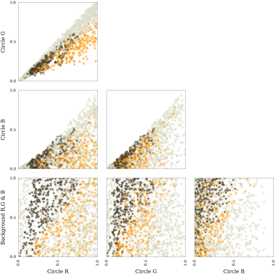
Notes on figure 1
These results are similar to what we saw previously.
Below we will plot the same data, transformed to HSV.
def to_hsv(d):
    d = pd.concat([pd.DataFrame([
        [row['ans'], *colorsys.rgb_to_hsv(row['circle_r'], row['circle_g'], row['circle_b']),
         colorsys.rgb_to_hsv(*[row['bg'],]*3)[2]]],
        columns=['ans', 'Circle Hue', 'Circle Sat', 'Circle Val', 'Background Val'])
     for idx, row in d.iterrows()])
    return d

def scatter_matrix_plot_hsv(data_):
    # Sadly, there are just enough differences to the previous figure that
    # I'm copying and editing it.
    plot_data = to_hsv(data_)
    ax1 = pd.plotting.scatter_matrix(plot_data.loc[:, data.columns != 'ans'],
                              c=color_list,
                              figsize=[20,20],
                              diagonal=None,
                              alpha=0.7,
                              s=200,
                              marker='*')
    ax1[0,0].yaxis.set_major_formatter(mpl.ticker.FormatStrFormatter('%.1f'))
    #plt.suptitle('Figure 1. Matrix of Scatter Plots for All Color Columns (RGB), with Points Colored by Answer');
    # Why is the title so far away?
    from matplotlib.ticker import (MultipleLocator, AutoMinorLocator)
    for i in range(np.shape(ax1)[0]):
        for j in range(np.shape(ax1)[1]):
            if i <= j:
                ax1[i,j].set_visible(False)
            else:
                ax1[i, j].tick_params(axis='both', which='major', labelsize=15, pad=10)
                ax1[i, j].xaxis.labelpad = 15
                ax1[i, j].yaxis.labelpad = 15
                ax1[i, j].xaxis.set_major_locator(MultipleLocator(0.5))
                ax1[i, j].yaxis.set_major_locator(MultipleLocator(0.5))
                ax1[i, j].set_ylim(0, 1.0)
            # Special treatment for hue.
            if j == 0:
                ax1[i, j].set_xlim(0.0, 0.20)
                ax1[i, j].xaxis.set_major_locator(MultipleLocator(0.1))
    plt.tight_layout()
scatter_matrix_plot_hsv(data)
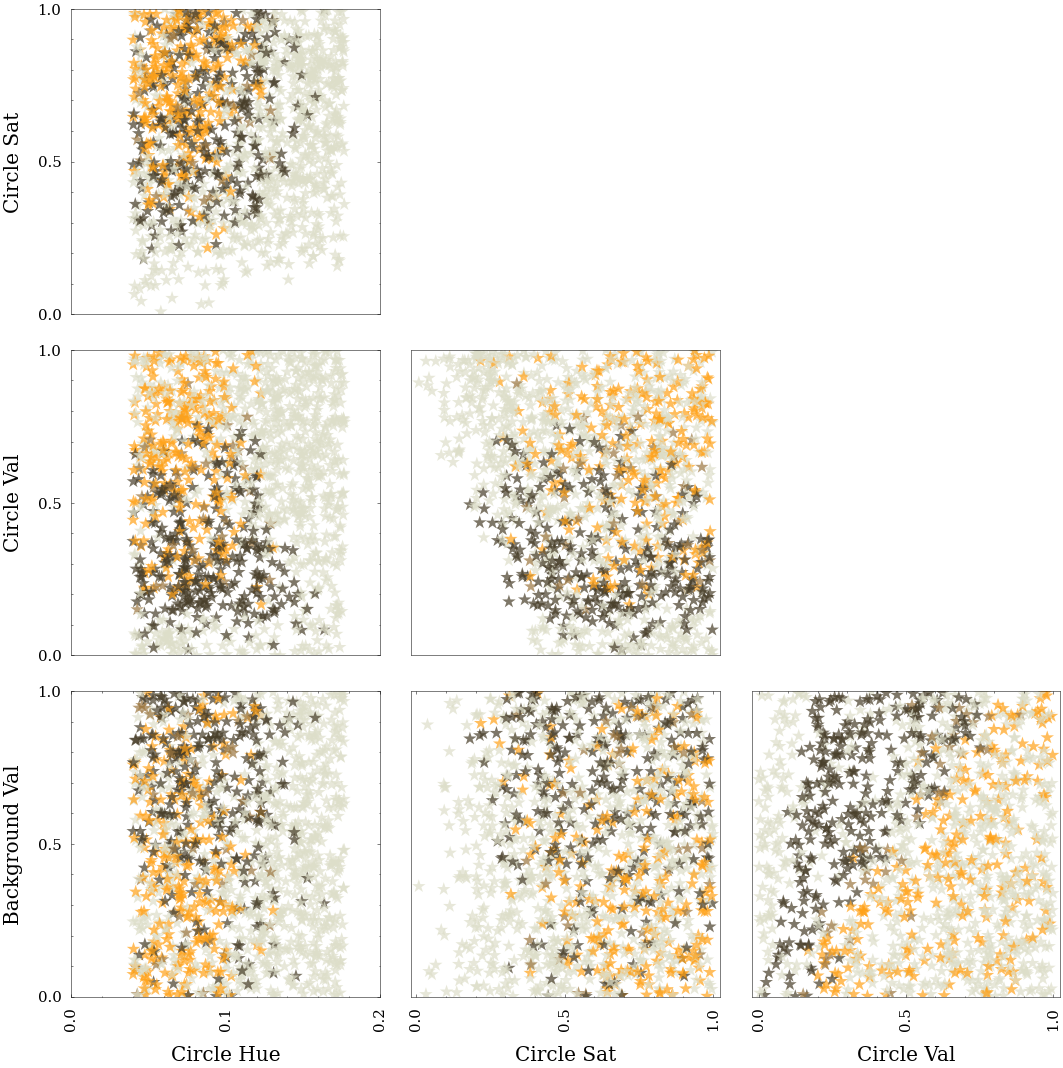
Notes on figure 2
This data is clearer than that from 1.1.1. We see again that the circle brightness and background brightness define the difference between orange and brown.
Combined data
The data from experiment 1.1.1 and 1.1.2 are combined into resources/exp_1_1/experiment_1_1_combined.csv. On inspecting the data, a number of entries seemed like misclassifications. These were tested again to confirm. Another file, resources/exp_1_1/experiment_1_1_combined_edited.csv has these points removed.